Bootstrap is most widley used CSS framework. Bootstrap is a part of front end and can be used with any other framework like angular, cms like WordPress and many more. This article covers most important bootstrap questions that are frequently asked in an interview.
What is bootstrap?
Bootstrap is free and open source CSS framework for developing responsive and mobile-first websites. It offers css grids, layout classes, tabs, nav menus, toggles, form, buttons, carousels, breadcrumb, popup & modal styling.
What is the brief history of bootstrap?
bootstrap was developed by Mark Otto and Jacob Thornton at twitter initially known as Twitter Blueprint.
Bootstrap 2 : introduced glyphicons
Bootstrap 3 : flat design & mobile first approach
Bootstrap 4: CSS flexbox support, Increasing global font size from 14px to 16px
What is bootstrap container & container fluid. Usually size?
container-fluid : max width is 100% and it is continuously changes as the browser window is resized.
Container: max width is 1140px and it is different for different media queries.
Both container and container-fluid have equal width i.e 100% for mobile devices.
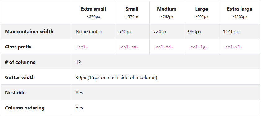
Explain bootstrap 4 grid?
Grid is used to design layout of the web page.
Bootstrap 4 grid system
What is normalize CSS in bootstrap?
Normalize CSS is used for making browsers display elements consistently. Bootstrap 4 already included normalize css there is no need to include it separately.
How to create drop down toggle in bootstrap 4?
<div class="dropdown show"><a class="btn btn-secondary dropdown-toggle" href="#" role="button" id="dropdownMenuLink" data-toggle="dropdown" aria-haspopup="true" aria-expanded="false">Dropdown link</a><div class="dropdown-menu" aria-labelledby="dropdownMenuLink"><a class="dropdown-item" href="#">Action</a><a class="dropdown-item" href="#">Another action</a><a class="dropdown-item" href="#">Something else here</a></div></div>
What are bootstrap 4 alignment classes?
Commonly used alignment classes are :
text-right
text-left
text-center
align-items-center
align-items-justify
justify-content-between
justify-content-around
justify-content-end
justify-content-start
justify-content-center
How to make image & content vertical middle in bootstrap 4
<div class="align-items-center">
     <img src="img1.jpg" alt="dummy-image">
     <div class="content-wrapper">
         <p>lorem ipsum dummy content. lorem ipsum dummy content.  lorem ipsum dummy content.  lorem ipsum dummy content.  lorem ipsum dummy content.</p>
     </div>
</div>
What is input groups?
Bootstrap input group is used to prepend or append the text before or after the input element.
 <div class="input-group">
    <input type="text" class="form-control" placeholder="Create Email">
    <div    class="input-group-append">
      <span class="input-group-text">@gmail.com</span>
         </div>
  </div>
How to create a tabbed, pills, and vertical pills navigation menu in Bootstrap?
Please check here for details
What are pagination && alert button classes?
Common pagination classes are
pagination
page-item
page-link
What is the default font sizes for heading & paragraph bootstrap 4?
paragraph : 16px
h1 : 2.5rem
h2 : 2rem
h3 : 1.75rem
h4: 1.5rem
h5: 1.25rem
h6 : 1 rem
How to make image responsive in bootstrap?
add class img-responsive to image.
What is scrollspy?
It automatically update navigation or list group components based on scroll position to indicate which link is currently active in the view port . Check demo here.
What is affix?
It is dropped in bootstrap 4. Instead of this position: sticky can be used.
What is progress bar?
<div class="progress">
  <div class="progress-bar bg-success  progress-bar-striped progress-bar-animated "    style="width:30%">
    Free Space
  </div>
     <div class="progress-bar bg-warning  progress-bar-striped progress-bar-animated " style="width:20%">
       Warning
  </div>
  <div class="progress-bar bg-danger  progress-bar-striped progress-bar-animated "    style="width:10%">
    Danger
  </div>
</div>
What do you mean by offset ?
Offsets are used to define spacing elements in the responsive grid.
<div class="row">
    <div class="col-md-4 col-md-offset-2">
        <p>test</p>
    </div>
</div>
This means the element will have a width of 4 columns and there will be 2 blank columns before the element (and as a consequence, will have 2 blank columns after).
Name some button classes?
<button type="button" class="btn btn-primary">Primary</button>
<button type="button" class="btn btn-secondary">Secondary</button>
<button type="button" class="btn btn-success">Success</button>
<button type="button" class="btn btn-danger">Danger</button>
<button type="button" class="btn btn-warning">Warning</button>
<button type="button" class="btn btn-info">Info</button>
<button type="button" class="btn btn-light">Light</button>
<button type="button" class="btn btn-dark">Dark</button>

<button type="button" class="btn btn-link">Link</button>
How to create breadcrumb with bootstrap?
<nav aria-label="breadcrumb">
  <ol class="breadcrumb">
    <li class="breadcrumb-item"><a href="#">Home</a></li>
    <li class="breadcrumb-item"><a href="#">Library</a></li>
    <li class="breadcrumb-item active" aria-current="page">Data</li>
  </ol>
</nav>
What are badges in bootstrap?
Badges scale to match the size of the immediate parent element by using relative font sizing and em units.
<span class="badge badge-primary">Primary</span>
<span class="badge badge-secondary">Secondary</span>
<span class="badge badge-success">Success</span>
<span class="badge badge-danger">Danger</span>
<span class="badge badge-warning">Warning</span>
<span class="badge badge-info">Info</span>
<span class="badge badge-light">Light</span>
<span class="badge badge-dark">Dark</span>
What are the media object class in bootstrap?
<div class="media">
  <img src="..." class="mr-3" alt="...">
  <div class="media-body">
    <h5 class="mt-0">Media heading</h5>
    Cras sit amet nibh libero, in gravida nulla. Nulla vel metus scelerisque ante sollicitudin. Cras purus odio, vestibulum in vulputate at, tempus viverra turpis. Fusce condimentum nunc ac nisi vulputate fringilla. Donec lacinia congue felis in faucibus.
  </div>
</div>
If you find this article useful then you may want to check CSS3 interview questions and start with JavaScript basic questions. If you find this article helpful please leave feedback.